How To · 6 min read · Oct 12, 2026
Writing Category Pages That Explain, Organise and Convert
Category pages work harder when they do more than label a section. Use concise copy and clear structure to help users understand the range, browse with ease and move towards the right choice.
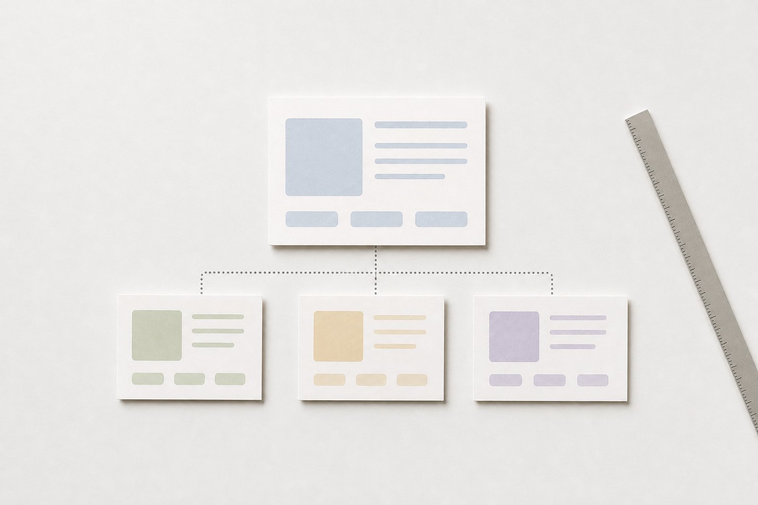
Category pages do more than hold a list of products or articles. They set expectations, reduce friction and help people decide whether to keep browsing. If the page only names the category, users have to do extra work to understand the range, relevance and next step. Good category copy closes that gap without turning the page into a sales pitch.
For ecommerce managers, UX writers and content strategists, the task is practical: keep the page useful as navigation, clear as content and consistent across the site. That usually means fewer words, better structure and more attention to context.
What a category page needs to do
A strong category page answers three questions quickly:
- What is this category?
- What belongs here?
- Where should I go next?
That sounds simple, but many pages fail at one of those jobs. A label alone can be too narrow. A long block of promotional copy can distract from the browsing task. A good page sits between the two.
The category heading gives the user orientation. The supporting copy clarifies scope, especially where a category could mean several things. If a page covers a broad range, the copy should signal that range. If the category is narrow, the copy should avoid over-explaining and keep the focus on the items available.
This is also where consistency matters. If your site uses different words for the same kind of thing in different places, users have to translate the language before they can browse. Stable category language supports both usability and editorial control.
How to write intro copy that adds context
Intro copy on a category page should earn its place. It is not there to fill space under the heading. It is there to make the page easier to use.
A useful intro does one or more of the following:
- defines the category in plain English
- clarifies what is included or excluded
- highlights the range on offer
- points users towards a sensible next step
Keep it short. Two or three sentences is often enough. The copy should be easy to scan and easy to skip. If users can understand the category from the heading alone, the intro should add context, not repetition.
A practical test is this: if you removed the intro, would the page become harder to browse? If the answer is no, the copy probably needs another job or less space.
Avoid writing the intro as a brand slogan or a mini advert. People on category pages are usually in decision mode. They want orientation first, persuasion second.
Use structure to help browsing
Category pages work best when the structure does some of the heavy lifting.
That means:
- clear subcategory labels
- grouped products or content
- concise supporting text where it prevents confusion
- visual hierarchy that makes scanning easy
Structure reduces the amount of interpretation users have to do. If a category includes several distinct types of item, grouping them helps people narrow in faster. If the range is simple, over-structuring can create unnecessary friction. The point is not to add more layers. It is to make the page legible.
For writers, this changes the job. You are not just writing a paragraph. You are shaping how the page is read. Headings, intro copy, short descriptions and link labels should work together. If one part is vague, the rest has to compensate.
Consistency across pages matters here too. When a user moves from one category to another, similar patterns and similar labels reduce cognitive load. They do not need to relearn the site each time.
Keep marketing copy in its place
Category pages often get overloaded because they are treated as a place to say everything at once. That usually makes the page less useful.
Common problems include:
- generic brand language that does not help selection
- long promotional paragraphs above the fold
- repeated adjectives that do not clarify the offer
- copy that competes with product tiles or filters
When marketing language dominates, the page stops doing its main job. Users have to work harder to find the items, compare options or understand the difference between categories.
A better approach is to reserve the page for orientation and decision support. If there is space for persuasion, keep it specific. Say what the category contains, what kind of choice it helps users make and what they should expect next. Avoid broad claims that could sit on any page on the site.
This is where editorial judgement matters. The strongest category copy is usually restrained. It supports the shopping or browsing task instead of interrupting it.
Improve clarity for both users and search
Clear category pages help people and search systems for the same reason: they make the page’s purpose explicit.
For users, clarity means faster recognition and less friction. For search, it means the page signals topic, scope and relevance more clearly. That does not require heavy repetition or awkward keyword use. It requires precise language.
A useful category page usually includes:
- a heading that matches the page purpose
- an intro that defines the category in natural language
- supporting labels that reflect real subtopics or product groupings
- language that stays consistent with the rest of the site
Do not force every page to carry the same amount of explanatory copy. Some categories need more context than others. Broader categories, ambiguous terms and pages with multiple subtypes often need a little more explanation. Simple, self-evident categories often need less.
The search benefit is strongest when the wording helps real users first. If the copy is written to be understandable and specific, it usually becomes easier for search engines to interpret too. That is a result of clarity, not a separate trick.
Examples of useful category copy choices
Here are a few bounded examples of the kind of decisions that help:
- A broad category such as office chairs may need a short intro that explains the range, for example different styles or use cases.
- A narrow category such as desk lamps may only need a brief line that confirms the type of products included.
- A content category page may benefit from a sentence that tells readers what kind of articles sit within the section and how they are grouped.
- A category with several subranges may need labels that separate those ranges cleanly before any descriptive copy is added.
The principle is the same in each case: explain the category, do not just name it.
A clearer category page starts with better context
Category pages do their best work when they help people decide, not just land. The copy should explain the scope, the structure should support browsing and the language should stay consistent across the site.
For teams building or reviewing category pages, the next step is simple: audit the page as a user would. Ask whether the heading, intro and structure make the category easier to understand in a few seconds. If they do not, the page is carrying the wrong words or too many of them.
Was this article helpful?