Email Marketing · 7 min read · Oct 8, 2026
Newsletter Writing Techniques That Keep Busy Readers Engaged
Practical newsletter writing techniques for busy readers, with a focus on clear structure, tight copy and useful calls to action that support repeat engagement.
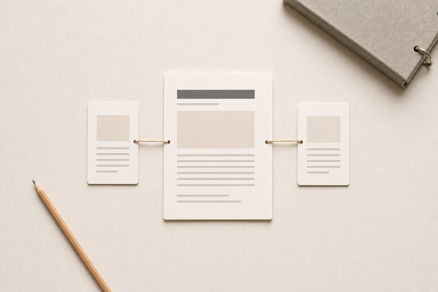
Busy readers do not need more to read; they need a clearer reason to keep going. A good newsletter earns attention by making each issue easy to scan, relevant enough to open, and useful enough to revisit. That usually comes down to editorial discipline: one focus, a tight structure, and a predictable reading experience that respects time.
For email marketers, content leads and internal communications teams, the practical challenge is not producing more copy. It is building a format that can carry useful information without drift. When a newsletter has a clear job, readers are more likely to understand what it is for, what to expect from it, and why the next issue is worth opening.
What makes a newsletter worth opening
A newsletter earns attention when the reader can see its value quickly. That value does not have to be dramatic. It has to be specific.
Start with relevance. If the subject line promises one thing and the email delivers something broader, the reader learns to treat the newsletter as background noise. The same risk appears when every issue tries to cover too much. Readers come back when they know the newsletter will help them stay informed, solve a small problem, or keep pace with a topic they already care about.
Clarity matters as much as subject matter. A busy reader should be able to scan the opening and understand three things:
- what the issue is about,
- why it matters now,
- and where to find the most useful part.
That is often enough to keep a reader engaged long enough to decide whether to continue.
Choose one focus before you write
A newsletter usually gets weaker when it tries to hold several unrelated priorities at once. One issue should have one clear editorial centre. That might be a product update, an internal policy change, a theme drawn from customer questions, or one practical idea the reader can use straight away.
A single focus does not mean a single note. It means every section should support the same purpose. If an update does not fit that purpose, it probably belongs in a different issue.
This is where editorial judgement matters. Not every useful item deserves equal space. A short lead item, a supporting detail, and one related link often work better than a long list of loosely connected points. The reader sees a shape, not a pile of information.
A simple test helps: if you removed one section, would the newsletter still feel coherent? If the answer is no, the issue may be trying to do too much.
Write an opening that gets to the point
The first paragraph should do more than introduce the topic. It should frame the value of the issue in plain language. Readers decide quickly whether to keep reading, so the opening has to earn the next line.
A strong intro often does three jobs:
- names the topic,
- gives the reader a reason to care,
- and sets up the structure that follows.
Avoid opening with vague scene-setting or a broad statement that could fit any newsletter. Busy readers respond better to directness. If the issue is about a new process, say what changed. If it is a content round-up, say what the reader will get from it. If it is an internal update, make the operational impact clear.
The transition into the main value should feel natural. You are not trying to write a clever lead-in. You are helping the reader move from context to use.
Use links, summaries and calls to action carefully
Links can make a newsletter more useful, but only when they are doing a clear job. A link should not exist because the design needs one. It should help the reader go deeper, act on the information, or access the source material behind the summary.
Short summaries matter because they reduce the cost of clicking. A reader should know what the linked piece covers before they leave the email. That is especially important when the audience is busy or reading on mobile. A useful summary says enough to guide the decision without repeating the whole article.
Calls to action work best when they are limited and aligned with the issue’s purpose. A newsletter can ask the reader to read, reply, register, download, review or share, but it should not ask for everything at once. One primary action is usually enough. If there is a secondary action, it should sit quietly and feel genuinely optional.
The question to ask is simple: does this link or CTA help the reader do something they already wanted to do? If not, it may be adding noise.
Keep each section useful on its own
In a well-built newsletter, each section has a job. If a reader skims or stops halfway through, they should still get something useful from what they have seen.
That means section headers need to be specific. A label like “This week” tells the reader very little. A label like “What changed in the approval process” tells them exactly what they are about to read. Specific headings also support scanning, which matters when readers are checking email between other tasks.
The body copy should stay tight. That does not mean stripped bare. It means every sentence should earn space by adding context, meaning or action. Repetition is one of the quickest ways to lose a busy reader. So is burying the point under too much explanation.
A useful pattern is:
- state the point,
- add one sentence of context,
- close with the action or implication.
That structure keeps the writing readable without flattening it.
Make the format consistent enough to trust
Readers return to newsletters that feel familiar. Consistency lowers the effort of reading. If the structure shifts too often, the audience has to re-learn how to use the email each time.
That consistency should apply to:
- voice,
- section order,
- length,
- and the type of value each issue delivers.
A predictable format does not have to feel repetitive. The content can change while the reading experience stays stable. That stability helps teams as well. It creates a usable editorial rhythm, gives writers clearer constraints, and makes the newsletter easier to maintain over time.
This is also where brand knowledge matters. A newsletter that is on-brand is not just recognisable in tone. It feels like it was written with the right context, structure and editorial judgement for that audience. That is what keeps it useful rather than merely regular.
Practical examples of a tighter newsletter approach
A product team could build an issue around one change, one implication and one support link. Instead of listing every release note, it highlights the update that affects the most readers, explains what has changed in one short paragraph and links to fuller documentation.
An internal communications team might structure an update around one policy shift. The email opens with what changed, follows with who is affected, and ends with one clear next step. That is more usable than a long memo wrapped in email form.
A content team could send a short editorial round-up built around one theme, such as reporting, planning or customer questions. Each item gets a brief summary and a reason it matters, rather than a generic list of links. The reader gets a coherent issue, not a feed.
Closing takeaway: design for the second read as much as the first
The best newsletters do not rely on a single strong send. They build trust over time by being clear, concise and consistently useful. If each issue has one focus, a clean opening, well-chosen links and a predictable structure, busy readers have less work to do and a better reason to come back.
For teams that need a steadier editorial rhythm, that usually comes down to context, structure and editorial judgement rather than more copy. That is the kind of system Hally Writer helps teams build: content that stays scalable without losing the brand knowledge that makes it worth reading.
Was this article helpful?